Friday, March 12, 2010

Great article about Marina Abramovic and the new exhibit at MoMa dedicated to her work. Abramovic is the performance artist we were talking about on Monday night.

http://www.nytimes.com/2010/03/12/arts/design/12abromovic.html?8dpc

“Marina Abramovic: The Artist Is Present” is opening at MoMA this sunday and is remaining on view through May 31.

Hope everyone has a great spring break !

Thursday, March 11, 2010


Homage to the Square

This was my first visit to the Hirshorn Museum and Sculpture Garden so I did not really know what to expect to see when I arrived. Before I visited the museum, someone mentioned in class that the only exhibition that they did not personally like at the museum was the one titled, “Homage to the Square.” So when I arrived at the museum this was the first artwork that I went looking for, as I wanted to see if I would get a similar reaction to what my classmate experienced. At first I had a very similar reaction, as I was almost bored when I first set my eyes on the large amounts of squares that surrounded me. But my thoughts changed when I took another look at the squares and really studied each piece both individually and as a whole collection. His work really stands out to anyone passing by due to the bright colors that catch your eye and capture your attention. Also due to the large amount of paintings you can’t help but notice as there are so many of them all around you. I did some research online and it said that this work by Josef Albers is his most well known and that, “these images create optical illusions, and challenge viewers’ visual acuity.” I really enjoyed how this artist was able to take such a simple concept and turn it into a beautiful and visually interesting piece. One would not normally think of different colored squares as art, but he really challenges his viewers to look at art with a more open mind and se it through a new pair of eyes.

Wednesday, March 10, 2010

Next Floor


During my visit to the Hirshhorn yesterday I was most intrigued by a piece entitled "Next Floor" by Phoebe Greenberg. It was a film 12 minutes long that was a direct commentary on how we consume too much as a society. While none of my own photography focuses on meaning like that, I do think it's an important point to be made. The film is set in a building with an infinite amount of floors in which a group of scary dictators, royalty, and so on are eating a meal. The meal is one of the most grotesque things I've ever seen. The waiters who have a very devilish look about them continue to feed the group at the table until they fall through the floor to the level below. This continues for several floors until it gets to the so called threshold and the gluttons at the table just begin to continue falling from floor to floor, never to be seen again. Truth be told, I had trouble watching it because I was so grossed out. I think that's exactly the point though, to question how they could be consuming such repulsive things and be so gluttonous about it nonetheless. There in lies the meaning of this short film though, the over-consumption of our society and the inevitable breaking point.

Monday, March 8, 2010

Inspirational Photo - John Doar


John Doar, my Grandfather, is a man who never looks for much praise or recognition, although I know he enjoys it from time to time. Born in a small town in Wisconsin he left his quiet life as a young lawyer to work in Washington D.C. for the Civil Rights Division of the United States Justice Department. Spending most of his time traveling in the deep South, trying to understand the problems that many people had been avoiding, it was his job as a civil rights lawyer to expose corruption and empower black communities. When people ask him why he did what he did and how did he find the courage, he answers in a calm, matter-of-fact manner that he was just doing the only type of work that he knew how to do.

This picture was taken in 1963 during a hot summer day in Mississippi. On the side of the street that you can see in the background of this image stood hundreds of trigger itchy local lawmen and on the other side of the street, invisible to the viewer, stood hundreds of African-Americans filled with grief and anger. They had just left the funeral of Medgar Evans, the field secretary of the NAACP, who a few evenings earlier had returned home after a long day of work only to be shot in the back as he got out of his car, his wife and children just inside the door.

While walking down the white business district singing “This Little Light of Mine” the peaceful protest began to escalate into a possible violent confrontation. There in the middle of two angry mobs my grandfather stepped out. Bottles and bricks were flying past his head and police dogs biting at his heels, but with the same familiar calm he stood tall and spoke to the crowd. “You’re not going to win anything with bottles and bricks. My name is John Doar – D-O-A-R, I’m from the Justice Department and anybody around here knows I stand for what is right.” He explained how Medgar Evans would not have wanted this and urged the crowds to disperse. Reporters who were present wrote about that day as being well on its way to becoming a violent riot of epic proportions if it was not for John Doar.

That day my grandfather did something that no lawyer is expected to do but as a friend of Medgar Evans, he told Charles Potis of the Los Angeles Times “it seemed the only thing to do.” It is not always about doing what you are asked to do but about doing what is right even in times of controversy or when there are possible consequences. This image reminds me of my grandfather’s courage and the values around which he lived his life.


Dovima with Elephants

Dovima and the Elephants
Photography has always been a large part of my childhood, namely because of my grandfather's recreational pursuit of the art after his retirement. When I was 12 my grandfather took my to see the Richard Avedon exhibit at the Fraenkel Photography Gallery in San Francsico because he thought it was important for me to expand my horizons. I was then and have since always been fascinated by Avedon's famous photograph of Dovima entitles 'Dovima and the Elephants'. I find this photograph to be so inspirational because I feel like I have grown up with it. I have always been into fashion and art and as I have learned more and more about this photo I realize how much it signifies the history of both of those things. The dress Dovima was wearing in the photo is an incrediably famous dress that was actually designed from the House of Christian Dior by Yves Saint Laurent himself and is now a famous piece of fashion history. Dovima herself is also a small piece of fashion's history. Dorothy Virginia Margaret Juba, best known as Dovima was the model who many in the industry herald as defining and beginning the era of the 'super model'. She is accredited as one of the most iconic women of fashion's time and as such represents a time when being a model wasn't just about being a waify 15 year old. I also have grown to appreciate Richard Avedon's work and realize the impact that it has had. Avedon has shot some very poinent and powerful photos that help put a retrospective view on many different aspects of our society. Overall, I find that despite the fact that it is so widely popular, Dovima and the Elephants is a photograph that has a special meaning that has inspired me the most.

"A Morir, Miguel Angel Rios"


I think what I really responded to in this piece was the raw power of the spinning tops. This was conveyed by a few means. The first of these was the perspective on the action. Besides the interesting fact that there were three different angles to look at simultaneously, the perspective was generally very low to the "ground" and up extremely close to the tops. As such, a whirring top could burst into the picture at any given moment, perhaps stopping perfectly and spinning right in front of you, knocking into other tops at high velocity, or whizzing right by and back out of the picture.

Besides the close up perspective, there was the quality of the sound which enhanced the sense of speed and intensity. I'm sure I'm not the only one to notice that it sounded eerily like a bombing raid being conducted overhead, with the whirring of the tops sounding much like airplane engines - first becoming louder and louder until they blew past you and the sound receded. All of this detailed surround sound led me to intimately feel the physicality of the tops.

This sense of power and motion was so palpable that I felt myself beginning to assign human characteristics to the tops. Some were larger than others and spun so quickly and with such force in one place that any smaller top which came into contact with them would quickly be blown away. These large tops seemed to me to be "proud" in the most self-satisfied sense, while the smaller tops were never as secure in their space and struck me as "timid" and afraid of their dangerous surroundings. Though the entire film is under five minutes long, near the end I was wholly engrossed in the struggles of these little beings (as I had begun to perceive them). When they slowly began to fall, their momentum withering one by one, I could not help but sense that this was an inexorable process and that their energy would not be replenished. That this would be a tragic occurence seemed a natural thought to me, and I perceived a degree of dignity in the way the last few tops stubbornly clung to motion until they hit the floor with a thud. I have to give Rios credit for getting me to so empathize with a bunch of tops and for bringing to light my own strong association between life and motion.

Hirshhorn Museum_Death

I enjoyed my visit to the Hirshhorn Museum very much and I had tons of fun playing color games of Josef Albers and admiring John Garrad's fabricated reality. I like many of the artworks, such as the "Map" by Evan olloway and the "Green House" by Michael Lucero. However, I would like to talk about "Til Death" by Minguel Angel Rios and "Play Dead, Real time" by Douglas Gordon. Both of the artists use black and white to represent the feeling of death, it is cold, restrained, and hopeless. Yet both artists connect movement or life with death; death is the ultimate end of all lives and energy.


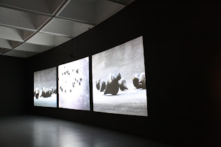
I especially like Minguel's piece. For me, all those turing tops are representations of human beings and the white gribs on the floor symbolize the different paths that people take in their lives. While human beings are walking their separate paths, they meet each other, love each other, or even hurt each other. However, at the end, we would all be tired and death seems to be the only ending of all. ( I also like our classmate Mel Turley's interpretation of soldiers and battlefield.)


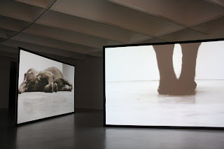
On the other hand, I also like the way Douglas express death through movement. Since the real time short film is made from a 360 degree perspective, it gives me an impression that the elephant is walking in circles and is trapped in that little squared room. It seems confused, hopeless, sad, but yet calm and quite. The small TV on the floor provides us with the facial expression of the elephant; it is hurt to see those teary and lifeless eyes.


The two pieces provide me with two contradictory human views toward death. "Til Death" represents the human attitude of avoiding death by fighting to live or breaking through the constrains of life. "Play dead" represents the human attitude of accepting death as it is and live a calm life within the limitations.


Map

As I walked around the Hirshhorn museum hoping one specific piece would stand out and "speak to me", I realized I was searching for the most dramatic and obscure work of art because that would be the obvious choice. When I was able to move past this thought and truly look for a piece I responded to, I walked through the room with this sculpture, 'Map', by Evan Holloway. While I love museums and can wander around in them for hours, rarely do I ever read the descriptions of the pieces or any information about the works. I usually come up with my own response to the artwork and leave it at that. With this sculpture, however, I was tempted to walk up to the description on the wall behind it and learn more about the work. That was when I knew I had genuinely responded to something in the Hirshhorn and would share my thoughts on it.

At first glance, without reading the information provided by the museum, 'Map', to me, appeared to be a commentary on the progression from life to death. With the vibrant, vivid colors on one end to the darkness of the blackest black, to the fading from gray to white, I assumed it could only be depicting one thing; life. Although I believe art should be interpreted however the viewer pleases, the description gave a little more insight into how the artist meant for the sculpture to be perceived. Built with tree branches creating lines and right angles, Holloway intended to use these pieces of nature to commentate on how life and nature can be so composed by humans and our cultures in both a structured and direct way as well as in a playful and colorful way. While my interpretation of the piece differed from the artist's desired intentions, reading Holloway's thoughts on the sculpture only allowed for me to respond to the work more and combine my depiction of it with Holloway's to create a completely unique response to the work.

Philosophy Rug # 3

The Hirshhorn Museum is one of the few museums I had not visited during my four years at George Washington University. When I recently visited, I found it to have some of the more interesting and thought-provoking pieces I have seen. The piece that caught my attention the most was the Philosophy Rug # 3 (not sure what the #3 stands for because I did not see #1 or #2, but nonetheless, I enjoyed this one.) Mungo Thomson created this wool rug in 2007, which spans nine feet tall and six feet wide. Woven together are vibrant color patches each drawing you in, to read a life lesson.

When you enter into the room the rug hangs directly in front of you and because of the variation of vibrant background colors and the color of the words on the color patches, your eyes bounce around initially not focusing on any one individually. What is interesting about the quotations is that each one is written in a way that forces the viewer to concentrate. With some of the sentences, the spacing is skewed so you cannot just skim over the quotes but rather have to decipher each one individually.

Each quote makes you think about life in a different way. I enjoyed reading each quote and trying to match them to a friend or family member. For example one of my favorites quotes was “life is too complicated in the morning.” Being someone who puts sleep as one of the top three things I love to do, I feel this fits me well.

Play Dead, Real Time Too


It looks like someone else appreciated the same large-screen elephant exhibit as me. However, I was particularly intrigued by the exhibit for an entirely different reason. The two screens were lit by a projector, and the screens were translucent, such that the image from one projector appeared on both sides of each screen. Therefore, along with the elephants performing their standing up and lying down routine, silhouettes of people would occasionally appear on the screens, and those people could make themselves part of the work. I believe this was intentional, perhaps to attempt to show the relative sizes of people (or their shadows) compared to elephants. The projector could have been placed high near the ceiling to avoid the shadows, but the artist chose to place them on the floor. I appreciate this type of interactive art.

Play Dead; Real Time

Play Dead; Real Time
During my recent trip to the Hirshhorn Museum I was most struck by a piece entitled "Play Dead; Real Time" by Douglas Gorson. The piece shows two large screens playing the same video at two different time intervals. The subject matter of the piece is a large elephant named Minnie, who originally was from India but was shot for this work in New York City. The screens of the piece are large enough so that Minnie appears as large as she would in real life. The work is shown without noise, and in the video Minnie beginnings as ‘dead,’ but then you watch her struggle to ‘come back to life’ in an empty gallery space. The videos are synced in a way that Minnie is simultaneously ‘alive’ and ‘dead’ at the same time on one screen or the other. I chose “Play Dead; Real Time” both because I am interested in large scale installation and also because I was intrigued by what the technique and meaning might be behind the piece. In the piece, the elephant is trained and is doing rather simple trained motions as it is being directed to by its trainer. However not knowing this you can get the impression that the elephant is playing dead for a reason, perhaps even out of necessity of survival. The elephant’s actions appear almost quite human in nature and as you watch the film you empathize with Minnie’s struggle. The film is also given a definite start and finish, with the start showing Minnie lying down but struggling to get up, which gives you the instant thought of emotionally pulling for her. Overall I thought the work was very effective and moving and I would be interested to see more works by Gorson.
-Christine Sanford

Four Colors Four Words - Joseph Kosuth


While wandering the Hirshhorn, there were a variety of pieces that demonstrated significant technical ability, artistic understanding, or creative imagination. It is these works that I tend to gravitate to: those that appear to have been the product of weeks if not months of diligent labor or a spark of creative genius. It is ironic, or at least I think, that then the piece that leaves the most indelible imprint in my mind is the one that appears most simplistic.
Ever since my first trip to the MOMA in New York, I have had an aversion to pieces that seem to give a slap in the face to all those deserving artists that spend decades striving for attention but never attain it. I have seen many odd things displayed at the MOMA: the front page of the New York Times haphazardly ripped out and crudely nailed to the wall, without even a frame; a white canvas, without any additional alteration, hanging on the wall still in its plastic packaging; an amorphous ceramic sculpture that it appeared took less than ten minutes to conceive and create. It is pieces like this where I imagine the artist laughing his way to the bank. But for some reason, it is Four Colors Four Words by Joseph Kosuth that keeps me thinking.
My reason for choosing this piece to discuss is this: it is Kosuth's work that led me to the realization of why this modern pieces are considered art. While creative and technical depth are subjective questions, I feel that one thing most people can agree on is that these modern pieces raise questions and force us to debate what defines art. It is a question that artists have long struggled with. Only until relatively recently has photography been embraced as an art form. Today, there continues a fierce debate over whether street art and graffiti is a form of destruction or an expression of urban culture.
There may be a deeper question that Kosuth is trying to convey in his piece. But if that's true, I unfortunately do not see it. What I do see is a minimalist work of art that has somehow provoked in me even larger questions of what defines art and how artistic tastes shape how pieces are judged. And it is because this piece is able to raise these questions that Kosuth is successful as an artist.
07.2.jpg When I was in high school we used to take a yearly trip to DC to see the Smithsonians and monuments. The first time I went to the Hirshhorn, my first impression was that it was full of pieces that existed solely to push the "what is art" envelope. Each piece seemed like it was trying to top the others in trying to be more unconventional. Room after room I rolled my eyes at what I thought were snarky and pretentious pieces of art until in one room I saw Ellsworth Kelly's "Red Yellow Blue V." At first glance I thought it was a full size diagonal wall, painted in stripes of red, yellow, and blue. As I walked closer though, I saw it was actually a canvas.
When I first saw the painting, I had a strong negative reaction to it. I found it to have a mocking tone, no aesthetic or technical value, and I was bored with all the "avant-garde" pieces in the museum. Seeing this painting again this weekend was strange. I liked it much better this time around. It seems somehow, more good-natured now. Whereas at first, I assumed the piece was meant to push boundaries, I can now see that it is a legitimate expression of the artist's aesthetic. Although I don't believe "Red Yellow Blue V" is the end-all-be-all of modern art, I appreciate its point of view and I can even manage to glean some aesthetic value from its giant color-blocked surface now.

I seemed to respond most to the short film Next Floor by Phoebe Greenberg. I thought it was extremely thought provoking and visually appealing, and I appreciated its social commentary.
The short film, which won at Cannes, is a depiction of a group of bourgeois type diners gorging themselves on exotic meats in pure and unadulterated gastronomic carnage. The conversation of excessive consumption in today’s society, which the film implies, is an important conversation to be had. There has long been concern with the pattern and scale of human activities having very serious impacts on the environment and human welfare. Especially today, people are living well beyond means. The insatiable hunger of the diners in the film is a wonderful visual metaphor. There is an insatiable hunger that has pervaded society, a movement towards excess and abundance, which has perpetuated a much inflated lifestyle. Greenberg masterfully reflects such a pertinent social issue in art form, and it leaves quite an impression. There is a sense of urgency in this film for people, on an individual and collective level, to rethink their actions and choices for a better and sustainable future.
I also appreciate the wonderful cinematography. The color composition, the lighting, the makeup, the costumes, the set- it all is extremely appealing within a grotesque and absurd context. The filmy successfully captures a still life quality and painting aesthetic. Each shot is in itself a work of art.
I like the surreal, absurdity of the film and the portrayal of gluttony. I like how the film makes you laugh and feel disgusted at the same time. I like how thought provoking it is. I left the film in deep contemplation. Why are we in an era of over-consumption? What brought on this lifestyle of excess? Are we ever satisfied? Are we ever fulfilled? What does it mean to be satisfied?

Sunday, March 7, 2010

Please Pass the Oysters


During my visit to the Hirshhorn Museum this weekend, I found my way to the black box theater one floor below the main entrance; what I found there was a film installation by Phoebe Greenberg titled "Next Floor". The 12-minute film is a lavish depiction of gluttony and indulgence at its tragic finest. Equipt with an endless amount of food and servants, the guests of a regel dinner party are treated to fine cuisine until their weight overwhelms the structure and they plummet to the next floor. Floor by floor, the guests continue to indulge until their weight sends them descending into an endless black hole. While the film has been compared to everything from Peter Newell's The Rocket Book to traditional dutch stills of food, it's hard to miss the obvious parallels to the contemporary political climate.

I was particularly struck by this installation because of the grotesque imagery and the unavoidable comparassion to American culture. Irony and dark humor combined with rich details and tangeble videography to create an incredibly memorable piece with a powerful message. Art that can make you feel these elements is always worth noting.

Finally, I found Greenberg's film has generated controversy about the thin line between art and film. As a student who studies both art and film, I find it interesting when films trascend one genre into another. Is film always art or are the rules less black and white?

Greenberg's film won Best Short Film at Cannes in 2008. Find time to check it out before it closes up shop on April 11, 2010!

Post by Kate Galliers

This print particularly caught my eye at the museum because of its endless meaning. I looked at it for a while and found many ways to interpret it as I am quite sure I could have found more the longer I analyzed it. I really appreciated open room with the three dimensional-esque designs on the wall that to me were representative of the vast space that the human mind encompasses, or can encompass if one so chooses.

The positioning of the human figure, the man, sitting on a board signified a human being in a seemingly quaint room and setting with potentially a lot going on within his mind yet anything that was going on was what the person made of it. I also was especially moved by the transparent space that existed below the man. I interpreted it as a manifestation of the possibilities that exist for a person not only in the room they are in but also above and below the basic conceptualizations their mind may achieve on a basic level.

The Soul of Morvan


The piece that inspired me the most was The Soul of Morvan by Jean Dubuff. The natural colors, lines, and textures of the piece put it in stark contrast to the other exhibits in the museum such as the tribute to squares by Josef Albers. Made of grape wood and vines and mounted on a slag base, the sculpture depicts a person and small tree in abstract form.

The use of natural materials gave the impression of a sculpture with minimal human influence. The natural look meant there was minimal repetition of design. Each section of the piece was unique in its own right.

While interpreting the meaning behind The Soul of Morvan’s I found myself wondering the importance of the person and the tree. The large size of the person compared to the tree also seemed odd. After viewing the piece for several minutes I decided that, like the natural use of materials, the depicted scene was actually meant to be an interpretation of a natural everyday event such as a walk in the woods. Whatever the meaning behind the piece, its organic look caught my eye and made me realize that it is important to utilize natural colors, lines, and textures in my photography.

The Gray Drape


Martha Rosler's "The Gray Drape"
2008

Funny story, the security guard spotted me looking at the piece for about 5 minutes and began to talk to me about the piece and what it is trying to show. After analyzing it for 10 minutes, we came to the conclusion that the image was a contrast between suffering and obliviousness.

Rosler’s piece is a photo montage, presenting the wealthy, fancy white woman from the 50s holding a flowing gray drape in her living room as soldiers, explosions, and a Muslim woman crying can be seen outside her window. At first sight, what caught my attention of the image was the contrast between the white woman and the Muslim woman. The Muslim woman looks as if she was in pain, crying hysterically, and the white woman is gracefully smiling as she holds on to the gray drape that flows across the room.

I read various critiques of the piece itself, but what interested me the most while I stood there and what I took from the image as I left the Hirshorn was the drape. I wondered about its color, its placement, and what it represents. I think that it represents something different to each woman in the image. To the wealthy woman, it represents luxury and prosperity, while to the Muslim woman it is like her veil that she must wear every day in her life.

'til death


The piece I had the strongest emotional response to was Miguel Angel Rios’s “A Morir (‘til Death).” This was the large three screen video installation featuring spinning and falling tops with booming sound accompanying the four minute long piece. The spinning and dropping tops were on top of a white grid providing a strong contrast with the otherwise black and gray composition.

It reminded me of violence and war as the tops ran out of momentum and knocked against each other causing those hit to fall to the floor. The “violence” of the spinning tops was augmented by the intense volume and size of the screens. The film was beautiful with clear and dramatic lighting making the tops seem like people.

The identical tops made me think of soldiers in uniform on a grid-like battlefield, each top dropping symbolizing a soldier being hit. I also found it interesting that this film created a vivid parallel in my mind yet a friend I went with was reminded of social groups letting people in and out, as almost a tangled web of social hierarchies. The piece could evoke such different reactions in anyone who sees it, something I found almost as interesting as the actual subject.

"Map"


The work that intrigued me the most at the Hirshhorn Museum was Evan Holloway's "Map". The piece was constructed using mostly tree branches, but it hardly looks natural at all. The branches are all connected at 90 degree angles, giving the overall design a very organized feel. "Map" immediately stuck out to me, because I really enjoy works that transform reality.

The work is both simple and complex. It's described as having a logical construction, which you can see from the uniformity of angles in the work. However, as the colors "evolve" from grayscale into all sorts of hues, the twigs branch out into a more complex structure. Gray lines become colorful chaos, all in a neat little box.

The lines aren't absolutely perfect, which is how it retains a sense of nature. The work was meant to critique how humans twist nature into their own man-made structure. Up close, the work does remind me of the colorful web-like structure of the DC Metro system. I can certainly appreciate Holloway's meaning, having lived in a city where every piece of nature is part of a larger urban grid.

Gyrostasis

Gyrostasis
Robert Smithson
1968


I was inspired by Gyrostasis by Robert Smithson. Robert Smithson defined "gyrostasis" as a branch of physics that relates to rotating bodies, and their tendency to maintain their equilibrium.

Constructed out of steel and white paint, this recreation of nature seems both natural and unnatural. This wave is static and white. It does not seem to carry force but it seems to be benign and manipulated. The color seems to make the wave almost sterile. However the spiral is found almost everywhere in nature.

It is interesting how motion is stuck in time in this sculpture. The shadow of the overlapping triangles mimic the movement of a wave crashing onto the shore.


I was inspired by Jesus Rafael Soto’s piece Two Volumes in Virtual. He used 100’s of yellow dowel rods sticking out of a yellow square to form the base and he used about half as many white rods to form the top. I enjoyed how he placed the small individual dowel rods close together to give the squares mass, but because the dowel rods were long and installed in rows and columns it made the bottom half of the yellow space seem airy while the top of the yellow area seemed more dense. Then depending on your position the piece would seemed to vary in density. Also, I like the use of a yellow back ground with the yellow rods because when looking down at the square once again the space seems even more solid, but the ends of rods and the amount of light on each rod breaks up the space.

As the Crow Flies/How I Miss the Avant-Garde


Upon visiting the Hirshorn Museum, I was particularly struck by Allen Ruppersberg's work "As the Crow Flies/How I Miss the Avant-Garde." The piece covers a part of two walls, and consists of vividly colorful overlapping posters. In his work, Ruppersberg explored the influence that advertisements and commercialization have had in his life, as the advertisements have changed to reflect events in his life and people he finds important. For example, one of the posters has the name, birth date and death date of a friend or lover of his. This work spoke to me, as I personally have an affinity for vintage posters from another time, as well as the collage effect that he made. I found it interesting that he superimposed personal aspects of his life on these overlapping posters, creating a vast visual and personal spectrum as his work that particularly spoke to me. I always love artists and photographers that are expressive in a way that allows for individual interpretation, and Ruppersberg's work is a perfect demonstration of that.