Monday, April 26, 2010

BlackBox & Sculptures


With the recent nice weather, I decided to go back to Hirshhorn to check out the sculpture garden and new BlackBlox and color exhibits. The sculptures were really cool to see because you could get so close. The detail in many of them was so intricate and they were of such massive size. Inside, the BlackBox exhibit sounded a lot better than it actually was, in my opinion. Described as " In “BLOCK B,” (2008), a motionless camera watches night and day as dramas unfold on the various floors of a massive apartment complex in Malaysia. It also went on to describe an aspect of voyeurism and insight into people's lives, which really intrigued me. The film itself was 20 min. long with the camera anchored in one spot filming the apartment building and people coming in and out of the actual rooms. There were voice overs where the artist guessed what the people were doing or saying in a narrative way. I think it was interesting to look at this building and see everyone coming in and out, going about the daily motions of life. I think the voice over could have been more interesting or gone into more detail. The shots of the building at night were definitely my favorite. The next exhibit I saw was called color forms that I guess was there last time we went, but I must have missed it. My favorite part of the exhibit was a square of pollen that was such a pure golden yellow. The intro to the exhibit with Rothko paintings was also impressive. Hirshhorn has definitely become my favorite museum in DC and I am definitely going back for the next opening exhibit in May.

Wednesday, April 21, 2010

Hirshhorn


What struck me the most was also Phoebe Greenberg's "Next Floor". The imagery was phenomenal, it really impressed me. The presentation of the food was incredibly unappetizing; nothing about this dinner looked appetizing. They were in a decrepit building, all dressed in what my limited fashion knowledge would consider Edwardian making it outdated. It sent a message that all these people were rich; but past their time and prime. It reminded me of Mad Max The Road Warrior, to quote " You're a scavenger, Max. You're a maggot. Did you know that? You're living off the corpse of the old world." This quote represents Phoebe's film. All the dishes served were corpses of animals. The intercom used by the butler was old, the building was old, it all was outdated. The message of course being that we need to change our ways before we collapse. Also, the effects were quite well done. The further they fell the more dust and debris they accumulated. I thought that was a nice touch. These people were shown wearing the best high society has to offer, in the worst light possible. This film was visually stimulating and presented it's argument clearly and effectively. I really enjoyed it.

Photo that inspires


Bela Lugosi got me into visual arts. I was very young the first time I watched Dracula, to this day Bela's eyes speak to me. He could say so much with his eyes and only his eyes. I consider this a great gift, one that is rare. He can convey emotion with as little as a squint. I think of photography in a similar fashion. We try to show an emotion or a story with our pictures, he did it with his eyes.
vintage horror films is appealing to me, it always has been. I find the elaborate sets and makeup much more interesting than computer generated props. In photography I feel the same way. This picture is so simple, yet it has stayed with me since childhood. It has power. In my own work I tend to gravitate towards pictures that are similar.
One goal for me is simplicity. This photograph is boiled down to an essence of a feeling. Not only is it black and white, but there is little gray. There are truly only two colors. The face and the hand are the only real distinguishable appendages. You only see what you absolutely need to.
The lighting is simple. It comes from one direction and creates a dark shadow that blocks part of the face. It leaves a lot to the imagination. He could be anywhere, even in the dark of your closet. Location is not important. What is is that he is staring and pointing directly at you. The whole picture doctored so you can only look at him. The strength is in the simplicity. I first learned about the power of simplicity from images similar to this one. It was a great revelation that I now apply in all aspects of my life. Grand elaborate spectacles become cluttered and often are more likely to be misinterpreted.

Tuesday, April 20, 2010

Hirshhorn Museum


I know this is a bit overdue, but I finally made it to the Hirshhorn museum this past week. To be honest, I did not respond to many of the works there, as I rarely do at modern art museums. The only work that really made an impact on me was an installment on fear at the Chicago Museum of Modern Art. A person goes into a pitch black room, and all that is seen is some green cat-like eyes in the distance and slowly a growling is heard all around. The growling slowly builds in intensity and volume and it is so realistic that many people (my friend and me included) ran out screaming. Since it was so dark, the eyes cannot adjust to any detail and you are forced to image the body that goes along with the pair of green eyes. It was an awesome experience.

At the Hirshhorn, one video installation that had an impact on me was “Play Dead; Real Time” by Douglas Gordon. In a big, darkened hall were two large screens with a movie playing on a loop of an elephant walking around a room and in a corner was a small TV with a close up of her eye which slowly zooms out. The elephant was walking in a circle and looking at both screens was nauseating because the rooms were spinning in different directions. Overall, the effect was overwhelming and mesmerizing.

Sunday, April 4, 2010

National Geographic Photo Exhibit


This weekend I went for a walk to Dupont and stumbled across the National Geographic museum. I went inside and saw a really incredible photography exhibit. The exhibit, called Sacred Waters by John Stanmyer, is a collection of images from around the world featuring people's beliefs and relationship with water in a spiritual sense. Here is a link to their website about it:

First the setting for the exhibit was perfect. It was a sun-filled room where you could see the sculpture garden outside. My favorite images were of people bathing in hot springs in Turkey and an amazing amount of people swimming in a waterfall in Haiti.

The images were from every corner of the world, taken in Haiti, Turkey, Laos, USA, and Japan to name a few places. The photographs gave a beautiful look into beliefs and customs that we rarely see in America. They showed how integral water is to so many cultures. Going to a school that was a combination of Buddhist/Catholic/Protestant faiths, I have seen water used in many sacraments and ceremonies. In many literary senses water is seen as cleansing and purifying. One image that I really identified with showed people washing their feet before entering a mosque. A quote below says something like "half of the faith is cleanliness."

It is a very interesting and extremely beautiful set of images that show a natural resource we so often take for granted in an entirely new light. I would definitely recommend checking it out!

Friday, March 12, 2010

Great article about Marina Abramovic and the new exhibit at MoMa dedicated to her work. Abramovic is the performance artist we were talking about on Monday night.

http://www.nytimes.com/2010/03/12/arts/design/12abromovic.html?8dpc

“Marina Abramovic: The Artist Is Present” is opening at MoMA this sunday and is remaining on view through May 31.

Hope everyone has a great spring break !

Thursday, March 11, 2010


Homage to the Square

This was my first visit to the Hirshorn Museum and Sculpture Garden so I did not really know what to expect to see when I arrived. Before I visited the museum, someone mentioned in class that the only exhibition that they did not personally like at the museum was the one titled, “Homage to the Square.” So when I arrived at the museum this was the first artwork that I went looking for, as I wanted to see if I would get a similar reaction to what my classmate experienced. At first I had a very similar reaction, as I was almost bored when I first set my eyes on the large amounts of squares that surrounded me. But my thoughts changed when I took another look at the squares and really studied each piece both individually and as a whole collection. His work really stands out to anyone passing by due to the bright colors that catch your eye and capture your attention. Also due to the large amount of paintings you can’t help but notice as there are so many of them all around you. I did some research online and it said that this work by Josef Albers is his most well known and that, “these images create optical illusions, and challenge viewers’ visual acuity.” I really enjoyed how this artist was able to take such a simple concept and turn it into a beautiful and visually interesting piece. One would not normally think of different colored squares as art, but he really challenges his viewers to look at art with a more open mind and se it through a new pair of eyes.

Wednesday, March 10, 2010

Next Floor


During my visit to the Hirshhorn yesterday I was most intrigued by a piece entitled "Next Floor" by Phoebe Greenberg. It was a film 12 minutes long that was a direct commentary on how we consume too much as a society. While none of my own photography focuses on meaning like that, I do think it's an important point to be made. The film is set in a building with an infinite amount of floors in which a group of scary dictators, royalty, and so on are eating a meal. The meal is one of the most grotesque things I've ever seen. The waiters who have a very devilish look about them continue to feed the group at the table until they fall through the floor to the level below. This continues for several floors until it gets to the so called threshold and the gluttons at the table just begin to continue falling from floor to floor, never to be seen again. Truth be told, I had trouble watching it because I was so grossed out. I think that's exactly the point though, to question how they could be consuming such repulsive things and be so gluttonous about it nonetheless. There in lies the meaning of this short film though, the over-consumption of our society and the inevitable breaking point.

Monday, March 8, 2010

Inspirational Photo - John Doar


John Doar, my Grandfather, is a man who never looks for much praise or recognition, although I know he enjoys it from time to time. Born in a small town in Wisconsin he left his quiet life as a young lawyer to work in Washington D.C. for the Civil Rights Division of the United States Justice Department. Spending most of his time traveling in the deep South, trying to understand the problems that many people had been avoiding, it was his job as a civil rights lawyer to expose corruption and empower black communities. When people ask him why he did what he did and how did he find the courage, he answers in a calm, matter-of-fact manner that he was just doing the only type of work that he knew how to do.

This picture was taken in 1963 during a hot summer day in Mississippi. On the side of the street that you can see in the background of this image stood hundreds of trigger itchy local lawmen and on the other side of the street, invisible to the viewer, stood hundreds of African-Americans filled with grief and anger. They had just left the funeral of Medgar Evans, the field secretary of the NAACP, who a few evenings earlier had returned home after a long day of work only to be shot in the back as he got out of his car, his wife and children just inside the door.

While walking down the white business district singing “This Little Light of Mine” the peaceful protest began to escalate into a possible violent confrontation. There in the middle of two angry mobs my grandfather stepped out. Bottles and bricks were flying past his head and police dogs biting at his heels, but with the same familiar calm he stood tall and spoke to the crowd. “You’re not going to win anything with bottles and bricks. My name is John Doar – D-O-A-R, I’m from the Justice Department and anybody around here knows I stand for what is right.” He explained how Medgar Evans would not have wanted this and urged the crowds to disperse. Reporters who were present wrote about that day as being well on its way to becoming a violent riot of epic proportions if it was not for John Doar.

That day my grandfather did something that no lawyer is expected to do but as a friend of Medgar Evans, he told Charles Potis of the Los Angeles Times “it seemed the only thing to do.” It is not always about doing what you are asked to do but about doing what is right even in times of controversy or when there are possible consequences. This image reminds me of my grandfather’s courage and the values around which he lived his life.


Dovima with Elephants

Dovima and the Elephants
Photography has always been a large part of my childhood, namely because of my grandfather's recreational pursuit of the art after his retirement. When I was 12 my grandfather took my to see the Richard Avedon exhibit at the Fraenkel Photography Gallery in San Francsico because he thought it was important for me to expand my horizons. I was then and have since always been fascinated by Avedon's famous photograph of Dovima entitles 'Dovima and the Elephants'. I find this photograph to be so inspirational because I feel like I have grown up with it. I have always been into fashion and art and as I have learned more and more about this photo I realize how much it signifies the history of both of those things. The dress Dovima was wearing in the photo is an incrediably famous dress that was actually designed from the House of Christian Dior by Yves Saint Laurent himself and is now a famous piece of fashion history. Dovima herself is also a small piece of fashion's history. Dorothy Virginia Margaret Juba, best known as Dovima was the model who many in the industry herald as defining and beginning the era of the 'super model'. She is accredited as one of the most iconic women of fashion's time and as such represents a time when being a model wasn't just about being a waify 15 year old. I also have grown to appreciate Richard Avedon's work and realize the impact that it has had. Avedon has shot some very poinent and powerful photos that help put a retrospective view on many different aspects of our society. Overall, I find that despite the fact that it is so widely popular, Dovima and the Elephants is a photograph that has a special meaning that has inspired me the most.

"A Morir, Miguel Angel Rios"


I think what I really responded to in this piece was the raw power of the spinning tops. This was conveyed by a few means. The first of these was the perspective on the action. Besides the interesting fact that there were three different angles to look at simultaneously, the perspective was generally very low to the "ground" and up extremely close to the tops. As such, a whirring top could burst into the picture at any given moment, perhaps stopping perfectly and spinning right in front of you, knocking into other tops at high velocity, or whizzing right by and back out of the picture.

Besides the close up perspective, there was the quality of the sound which enhanced the sense of speed and intensity. I'm sure I'm not the only one to notice that it sounded eerily like a bombing raid being conducted overhead, with the whirring of the tops sounding much like airplane engines - first becoming louder and louder until they blew past you and the sound receded. All of this detailed surround sound led me to intimately feel the physicality of the tops.

This sense of power and motion was so palpable that I felt myself beginning to assign human characteristics to the tops. Some were larger than others and spun so quickly and with such force in one place that any smaller top which came into contact with them would quickly be blown away. These large tops seemed to me to be "proud" in the most self-satisfied sense, while the smaller tops were never as secure in their space and struck me as "timid" and afraid of their dangerous surroundings. Though the entire film is under five minutes long, near the end I was wholly engrossed in the struggles of these little beings (as I had begun to perceive them). When they slowly began to fall, their momentum withering one by one, I could not help but sense that this was an inexorable process and that their energy would not be replenished. That this would be a tragic occurence seemed a natural thought to me, and I perceived a degree of dignity in the way the last few tops stubbornly clung to motion until they hit the floor with a thud. I have to give Rios credit for getting me to so empathize with a bunch of tops and for bringing to light my own strong association between life and motion.

Hirshhorn Museum_Death

I enjoyed my visit to the Hirshhorn Museum very much and I had tons of fun playing color games of Josef Albers and admiring John Garrad's fabricated reality. I like many of the artworks, such as the "Map" by Evan olloway and the "Green House" by Michael Lucero. However, I would like to talk about "Til Death" by Minguel Angel Rios and "Play Dead, Real time" by Douglas Gordon. Both of the artists use black and white to represent the feeling of death, it is cold, restrained, and hopeless. Yet both artists connect movement or life with death; death is the ultimate end of all lives and energy.


I especially like Minguel's piece. For me, all those turing tops are representations of human beings and the white gribs on the floor symbolize the different paths that people take in their lives. While human beings are walking their separate paths, they meet each other, love each other, or even hurt each other. However, at the end, we would all be tired and death seems to be the only ending of all. ( I also like our classmate Mel Turley's interpretation of soldiers and battlefield.)


On the other hand, I also like the way Douglas express death through movement. Since the real time short film is made from a 360 degree perspective, it gives me an impression that the elephant is walking in circles and is trapped in that little squared room. It seems confused, hopeless, sad, but yet calm and quite. The small TV on the floor provides us with the facial expression of the elephant; it is hurt to see those teary and lifeless eyes.


The two pieces provide me with two contradictory human views toward death. "Til Death" represents the human attitude of avoiding death by fighting to live or breaking through the constrains of life. "Play dead" represents the human attitude of accepting death as it is and live a calm life within the limitations.


Map

As I walked around the Hirshhorn museum hoping one specific piece would stand out and "speak to me", I realized I was searching for the most dramatic and obscure work of art because that would be the obvious choice. When I was able to move past this thought and truly look for a piece I responded to, I walked through the room with this sculpture, 'Map', by Evan Holloway. While I love museums and can wander around in them for hours, rarely do I ever read the descriptions of the pieces or any information about the works. I usually come up with my own response to the artwork and leave it at that. With this sculpture, however, I was tempted to walk up to the description on the wall behind it and learn more about the work. That was when I knew I had genuinely responded to something in the Hirshhorn and would share my thoughts on it.

At first glance, without reading the information provided by the museum, 'Map', to me, appeared to be a commentary on the progression from life to death. With the vibrant, vivid colors on one end to the darkness of the blackest black, to the fading from gray to white, I assumed it could only be depicting one thing; life. Although I believe art should be interpreted however the viewer pleases, the description gave a little more insight into how the artist meant for the sculpture to be perceived. Built with tree branches creating lines and right angles, Holloway intended to use these pieces of nature to commentate on how life and nature can be so composed by humans and our cultures in both a structured and direct way as well as in a playful and colorful way. While my interpretation of the piece differed from the artist's desired intentions, reading Holloway's thoughts on the sculpture only allowed for me to respond to the work more and combine my depiction of it with Holloway's to create a completely unique response to the work.

Philosophy Rug # 3

The Hirshhorn Museum is one of the few museums I had not visited during my four years at George Washington University. When I recently visited, I found it to have some of the more interesting and thought-provoking pieces I have seen. The piece that caught my attention the most was the Philosophy Rug # 3 (not sure what the #3 stands for because I did not see #1 or #2, but nonetheless, I enjoyed this one.) Mungo Thomson created this wool rug in 2007, which spans nine feet tall and six feet wide. Woven together are vibrant color patches each drawing you in, to read a life lesson.

When you enter into the room the rug hangs directly in front of you and because of the variation of vibrant background colors and the color of the words on the color patches, your eyes bounce around initially not focusing on any one individually. What is interesting about the quotations is that each one is written in a way that forces the viewer to concentrate. With some of the sentences, the spacing is skewed so you cannot just skim over the quotes but rather have to decipher each one individually.

Each quote makes you think about life in a different way. I enjoyed reading each quote and trying to match them to a friend or family member. For example one of my favorites quotes was “life is too complicated in the morning.” Being someone who puts sleep as one of the top three things I love to do, I feel this fits me well.

Play Dead, Real Time Too


It looks like someone else appreciated the same large-screen elephant exhibit as me. However, I was particularly intrigued by the exhibit for an entirely different reason. The two screens were lit by a projector, and the screens were translucent, such that the image from one projector appeared on both sides of each screen. Therefore, along with the elephants performing their standing up and lying down routine, silhouettes of people would occasionally appear on the screens, and those people could make themselves part of the work. I believe this was intentional, perhaps to attempt to show the relative sizes of people (or their shadows) compared to elephants. The projector could have been placed high near the ceiling to avoid the shadows, but the artist chose to place them on the floor. I appreciate this type of interactive art.

Play Dead; Real Time

Play Dead; Real Time
During my recent trip to the Hirshhorn Museum I was most struck by a piece entitled "Play Dead; Real Time" by Douglas Gorson. The piece shows two large screens playing the same video at two different time intervals. The subject matter of the piece is a large elephant named Minnie, who originally was from India but was shot for this work in New York City. The screens of the piece are large enough so that Minnie appears as large as she would in real life. The work is shown without noise, and in the video Minnie beginnings as ‘dead,’ but then you watch her struggle to ‘come back to life’ in an empty gallery space. The videos are synced in a way that Minnie is simultaneously ‘alive’ and ‘dead’ at the same time on one screen or the other. I chose “Play Dead; Real Time” both because I am interested in large scale installation and also because I was intrigued by what the technique and meaning might be behind the piece. In the piece, the elephant is trained and is doing rather simple trained motions as it is being directed to by its trainer. However not knowing this you can get the impression that the elephant is playing dead for a reason, perhaps even out of necessity of survival. The elephant’s actions appear almost quite human in nature and as you watch the film you empathize with Minnie’s struggle. The film is also given a definite start and finish, with the start showing Minnie lying down but struggling to get up, which gives you the instant thought of emotionally pulling for her. Overall I thought the work was very effective and moving and I would be interested to see more works by Gorson.
-Christine Sanford

Four Colors Four Words - Joseph Kosuth


While wandering the Hirshhorn, there were a variety of pieces that demonstrated significant technical ability, artistic understanding, or creative imagination. It is these works that I tend to gravitate to: those that appear to have been the product of weeks if not months of diligent labor or a spark of creative genius. It is ironic, or at least I think, that then the piece that leaves the most indelible imprint in my mind is the one that appears most simplistic.
Ever since my first trip to the MOMA in New York, I have had an aversion to pieces that seem to give a slap in the face to all those deserving artists that spend decades striving for attention but never attain it. I have seen many odd things displayed at the MOMA: the front page of the New York Times haphazardly ripped out and crudely nailed to the wall, without even a frame; a white canvas, without any additional alteration, hanging on the wall still in its plastic packaging; an amorphous ceramic sculpture that it appeared took less than ten minutes to conceive and create. It is pieces like this where I imagine the artist laughing his way to the bank. But for some reason, it is Four Colors Four Words by Joseph Kosuth that keeps me thinking.
My reason for choosing this piece to discuss is this: it is Kosuth's work that led me to the realization of why this modern pieces are considered art. While creative and technical depth are subjective questions, I feel that one thing most people can agree on is that these modern pieces raise questions and force us to debate what defines art. It is a question that artists have long struggled with. Only until relatively recently has photography been embraced as an art form. Today, there continues a fierce debate over whether street art and graffiti is a form of destruction or an expression of urban culture.
There may be a deeper question that Kosuth is trying to convey in his piece. But if that's true, I unfortunately do not see it. What I do see is a minimalist work of art that has somehow provoked in me even larger questions of what defines art and how artistic tastes shape how pieces are judged. And it is because this piece is able to raise these questions that Kosuth is successful as an artist.
07.2.jpg When I was in high school we used to take a yearly trip to DC to see the Smithsonians and monuments. The first time I went to the Hirshhorn, my first impression was that it was full of pieces that existed solely to push the "what is art" envelope. Each piece seemed like it was trying to top the others in trying to be more unconventional. Room after room I rolled my eyes at what I thought were snarky and pretentious pieces of art until in one room I saw Ellsworth Kelly's "Red Yellow Blue V." At first glance I thought it was a full size diagonal wall, painted in stripes of red, yellow, and blue. As I walked closer though, I saw it was actually a canvas.
When I first saw the painting, I had a strong negative reaction to it. I found it to have a mocking tone, no aesthetic or technical value, and I was bored with all the "avant-garde" pieces in the museum. Seeing this painting again this weekend was strange. I liked it much better this time around. It seems somehow, more good-natured now. Whereas at first, I assumed the piece was meant to push boundaries, I can now see that it is a legitimate expression of the artist's aesthetic. Although I don't believe "Red Yellow Blue V" is the end-all-be-all of modern art, I appreciate its point of view and I can even manage to glean some aesthetic value from its giant color-blocked surface now.

I seemed to respond most to the short film Next Floor by Phoebe Greenberg. I thought it was extremely thought provoking and visually appealing, and I appreciated its social commentary.
The short film, which won at Cannes, is a depiction of a group of bourgeois type diners gorging themselves on exotic meats in pure and unadulterated gastronomic carnage. The conversation of excessive consumption in today’s society, which the film implies, is an important conversation to be had. There has long been concern with the pattern and scale of human activities having very serious impacts on the environment and human welfare. Especially today, people are living well beyond means. The insatiable hunger of the diners in the film is a wonderful visual metaphor. There is an insatiable hunger that has pervaded society, a movement towards excess and abundance, which has perpetuated a much inflated lifestyle. Greenberg masterfully reflects such a pertinent social issue in art form, and it leaves quite an impression. There is a sense of urgency in this film for people, on an individual and collective level, to rethink their actions and choices for a better and sustainable future.
I also appreciate the wonderful cinematography. The color composition, the lighting, the makeup, the costumes, the set- it all is extremely appealing within a grotesque and absurd context. The filmy successfully captures a still life quality and painting aesthetic. Each shot is in itself a work of art.
I like the surreal, absurdity of the film and the portrayal of gluttony. I like how the film makes you laugh and feel disgusted at the same time. I like how thought provoking it is. I left the film in deep contemplation. Why are we in an era of over-consumption? What brought on this lifestyle of excess? Are we ever satisfied? Are we ever fulfilled? What does it mean to be satisfied?

Sunday, March 7, 2010

Please Pass the Oysters


During my visit to the Hirshhorn Museum this weekend, I found my way to the black box theater one floor below the main entrance; what I found there was a film installation by Phoebe Greenberg titled "Next Floor". The 12-minute film is a lavish depiction of gluttony and indulgence at its tragic finest. Equipt with an endless amount of food and servants, the guests of a regel dinner party are treated to fine cuisine until their weight overwhelms the structure and they plummet to the next floor. Floor by floor, the guests continue to indulge until their weight sends them descending into an endless black hole. While the film has been compared to everything from Peter Newell's The Rocket Book to traditional dutch stills of food, it's hard to miss the obvious parallels to the contemporary political climate.

I was particularly struck by this installation because of the grotesque imagery and the unavoidable comparassion to American culture. Irony and dark humor combined with rich details and tangeble videography to create an incredibly memorable piece with a powerful message. Art that can make you feel these elements is always worth noting.

Finally, I found Greenberg's film has generated controversy about the thin line between art and film. As a student who studies both art and film, I find it interesting when films trascend one genre into another. Is film always art or are the rules less black and white?

Greenberg's film won Best Short Film at Cannes in 2008. Find time to check it out before it closes up shop on April 11, 2010!

Post by Kate Galliers

This print particularly caught my eye at the museum because of its endless meaning. I looked at it for a while and found many ways to interpret it as I am quite sure I could have found more the longer I analyzed it. I really appreciated open room with the three dimensional-esque designs on the wall that to me were representative of the vast space that the human mind encompasses, or can encompass if one so chooses.

The positioning of the human figure, the man, sitting on a board signified a human being in a seemingly quaint room and setting with potentially a lot going on within his mind yet anything that was going on was what the person made of it. I also was especially moved by the transparent space that existed below the man. I interpreted it as a manifestation of the possibilities that exist for a person not only in the room they are in but also above and below the basic conceptualizations their mind may achieve on a basic level.

The Soul of Morvan


The piece that inspired me the most was The Soul of Morvan by Jean Dubuff. The natural colors, lines, and textures of the piece put it in stark contrast to the other exhibits in the museum such as the tribute to squares by Josef Albers. Made of grape wood and vines and mounted on a slag base, the sculpture depicts a person and small tree in abstract form.

The use of natural materials gave the impression of a sculpture with minimal human influence. The natural look meant there was minimal repetition of design. Each section of the piece was unique in its own right.

While interpreting the meaning behind The Soul of Morvan’s I found myself wondering the importance of the person and the tree. The large size of the person compared to the tree also seemed odd. After viewing the piece for several minutes I decided that, like the natural use of materials, the depicted scene was actually meant to be an interpretation of a natural everyday event such as a walk in the woods. Whatever the meaning behind the piece, its organic look caught my eye and made me realize that it is important to utilize natural colors, lines, and textures in my photography.

The Gray Drape


Martha Rosler's "The Gray Drape"
2008

Funny story, the security guard spotted me looking at the piece for about 5 minutes and began to talk to me about the piece and what it is trying to show. After analyzing it for 10 minutes, we came to the conclusion that the image was a contrast between suffering and obliviousness.

Rosler’s piece is a photo montage, presenting the wealthy, fancy white woman from the 50s holding a flowing gray drape in her living room as soldiers, explosions, and a Muslim woman crying can be seen outside her window. At first sight, what caught my attention of the image was the contrast between the white woman and the Muslim woman. The Muslim woman looks as if she was in pain, crying hysterically, and the white woman is gracefully smiling as she holds on to the gray drape that flows across the room.

I read various critiques of the piece itself, but what interested me the most while I stood there and what I took from the image as I left the Hirshorn was the drape. I wondered about its color, its placement, and what it represents. I think that it represents something different to each woman in the image. To the wealthy woman, it represents luxury and prosperity, while to the Muslim woman it is like her veil that she must wear every day in her life.

'til death


The piece I had the strongest emotional response to was Miguel Angel Rios’s “A Morir (‘til Death).” This was the large three screen video installation featuring spinning and falling tops with booming sound accompanying the four minute long piece. The spinning and dropping tops were on top of a white grid providing a strong contrast with the otherwise black and gray composition.

It reminded me of violence and war as the tops ran out of momentum and knocked against each other causing those hit to fall to the floor. The “violence” of the spinning tops was augmented by the intense volume and size of the screens. The film was beautiful with clear and dramatic lighting making the tops seem like people.

The identical tops made me think of soldiers in uniform on a grid-like battlefield, each top dropping symbolizing a soldier being hit. I also found it interesting that this film created a vivid parallel in my mind yet a friend I went with was reminded of social groups letting people in and out, as almost a tangled web of social hierarchies. The piece could evoke such different reactions in anyone who sees it, something I found almost as interesting as the actual subject.

"Map"


The work that intrigued me the most at the Hirshhorn Museum was Evan Holloway's "Map". The piece was constructed using mostly tree branches, but it hardly looks natural at all. The branches are all connected at 90 degree angles, giving the overall design a very organized feel. "Map" immediately stuck out to me, because I really enjoy works that transform reality.

The work is both simple and complex. It's described as having a logical construction, which you can see from the uniformity of angles in the work. However, as the colors "evolve" from grayscale into all sorts of hues, the twigs branch out into a more complex structure. Gray lines become colorful chaos, all in a neat little box.

The lines aren't absolutely perfect, which is how it retains a sense of nature. The work was meant to critique how humans twist nature into their own man-made structure. Up close, the work does remind me of the colorful web-like structure of the DC Metro system. I can certainly appreciate Holloway's meaning, having lived in a city where every piece of nature is part of a larger urban grid.

Gyrostasis

Gyrostasis
Robert Smithson
1968


I was inspired by Gyrostasis by Robert Smithson. Robert Smithson defined "gyrostasis" as a branch of physics that relates to rotating bodies, and their tendency to maintain their equilibrium.

Constructed out of steel and white paint, this recreation of nature seems both natural and unnatural. This wave is static and white. It does not seem to carry force but it seems to be benign and manipulated. The color seems to make the wave almost sterile. However the spiral is found almost everywhere in nature.

It is interesting how motion is stuck in time in this sculpture. The shadow of the overlapping triangles mimic the movement of a wave crashing onto the shore.


I was inspired by Jesus Rafael Soto’s piece Two Volumes in Virtual. He used 100’s of yellow dowel rods sticking out of a yellow square to form the base and he used about half as many white rods to form the top. I enjoyed how he placed the small individual dowel rods close together to give the squares mass, but because the dowel rods were long and installed in rows and columns it made the bottom half of the yellow space seem airy while the top of the yellow area seemed more dense. Then depending on your position the piece would seemed to vary in density. Also, I like the use of a yellow back ground with the yellow rods because when looking down at the square once again the space seems even more solid, but the ends of rods and the amount of light on each rod breaks up the space.

As the Crow Flies/How I Miss the Avant-Garde


Upon visiting the Hirshorn Museum, I was particularly struck by Allen Ruppersberg's work "As the Crow Flies/How I Miss the Avant-Garde." The piece covers a part of two walls, and consists of vividly colorful overlapping posters. In his work, Ruppersberg explored the influence that advertisements and commercialization have had in his life, as the advertisements have changed to reflect events in his life and people he finds important. For example, one of the posters has the name, birth date and death date of a friend or lover of his. This work spoke to me, as I personally have an affinity for vintage posters from another time, as well as the collage effect that he made. I found it interesting that he superimposed personal aspects of his life on these overlapping posters, creating a vast visual and personal spectrum as his work that particularly spoke to me. I always love artists and photographers that are expressive in a way that allows for individual interpretation, and Ruppersberg's work is a perfect demonstration of that.

Wednesday, February 24, 2010

EVENTS AT GWU THIS WEEK + TRIP TO NYC

Check some of this out!!!

Thursday: Artist Phoebe Greenberg will be at the Hirshhorn for a "Meet the Artist" talk at 7pm. Ms. Greenberg's film Next Floor was awarded Best Short Film, International Critic’s Week at the 2008 Cannes Film Festival.

Friday: The New York City bus trip is this Friday, February 26. This trip is free for FAAH students and there are many spots still available so please email art@gwu.edu or stop by the main office to sign up.

Sunday: Prof. Patrick McDonough has an exhibition at The 29th Street Gallery and Project Space at Gateway Arts Center in Brentwood, MD. The artist’s talk and reception is Sunday from 3-5pm.


More information about all of these events can be found at http://www.gwu.edu/~art/events.html.

Tuesday, February 23, 2010

This picture was taken during the height of the civil rights movement, at the Olympics in Mexico City in 1968. To me, it evokes a wide range of, sometimes contradictory, emotions: unity, loneliness, strength, perseverance, defiance, solidarity. There’s the “leader” Tommie Smith, gold medalist, holding his fist up high, seeming to tell the world, “I can do this, we can do this, and we will not be defeated.” Yet I can’t stop wondering what he is actually thinking, as he looks very pensive and cerebral in his stature. There’s his “sidekick,” bronze medalist John Carlos, the loyal follower - happy to be assisting his teammate, and with a slight hint of a satisfaction on his face, perhaps happy to have won a medal as well. And then there’s the Australian, who seems either oblivious or purposefully ignorant to what’s going on behind him, or is it next to him – it’s hard to tell.

The photograph is simple enough – three men in clear focus, standing on a podium for all the world to see. Yet no one is looking at the camera. The two Americans seem to be perhaps closing their eyes, or looking at the ground. The Australian seems to be staring into space, missing the incredibly rebellious moment of the two men next to him. We can’t recognize any other people in the photograph. It makes me wonder – who is their audience? Who was watching this incredible moment? Did Mexicans, Australians, and other people in other countries understand the magnitude and importance of the civil rights movement in the U.S.? Were there Americans who were burying their heads in the sand or staring into nothingness as well? Perhaps these two bold athletes left it up to whoever was watching to join in the cause and make the next move in the fight for equal rights.

Ironically, or perhaps not so ironically in view of other individuals’ actions during the civil rights movement (Rosa Parks spending time in jail, for example), these two men were suspended from the U.S. team as a result of their actions. The powers that be would not tolerate political statements made during the Olympics, which should be about sport and competition.

Yet the picture remains a classic image in Olympic history and in the civil rights movement. These men took a bold risk for their noble cause, and ultimately for their country.


Australia

This image of Australia evokes many emotions for me. I was originally supposed to go abroad to Australia in the second semester of my Junior year, but it did not for a variety of reasons. I had had this image stored as my desktop image for a very long time because it manifested an extraordinary possible and opportunity to me. Having read about Australia’s offerings from its rich animal life to beautiful scenery including its beaches I associate all of these qualities with this image.

The water in this picture is set with a beautiful light that makes it look most serene and soothing. Water has presented a sense of calm and relaxation to me since I was young as I have always treasured beaches more than any other place. Seeing the water in this picture, even with the bridges in the background and the well-known sculpture I still associate the water with beaches since I have done so much research including reading and looking over many pictures of the beaches of Australia.

Having not been to Australia and appreciating its allure so much from every picture I see of it, especially this one, my inspiration is to one day make it there, whether it be for a vacation or to live there for a certain amount of time. Therefore, this picture is especially important to me because it embodies the hope and possibility that Australia is there and will hopefully still be there in the same beauty it is in today when I eventually make my way there.

Monday, February 22, 2010

Photos That Inspire


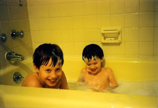
This image of me and my little brother fills me with nostalgia every time I look at it. The warmth of those hot, sudsy baths I took as a child is instantly palpable to me, especially in the frigid February weather of the present. I took so many baths as a young kid that I think I permanently associate them with childhood and can very easily shut off my mind and melt away the rest of the world. While it’s only on rare occasions that I get to enjoy one nowadays, I still relish slipping into a nearly scalding hot bath and just soaking for a while. The repetition of a simple action from my childhood has a meditative quality for me.


Of course its not as though any old image of a bathtub would stir up the emotional response that this one does. This particular image has a number of things going for it. As far as color is concerned, my family never did like this “Twinkie yellow” shade in the bathroom, and it wasn’t long after this picture was taken that we redid the tiles. Yet in this instance I think the yellow only accentuates the warmth of the image and helps bring out the ruddy, healthy complexion of our skin. Our young vitality pops out at me.


The moment that is captured here is really something special. Faint traces of bubbles in me and my brother’s hair and on our faces remind me of the “bubblebeards” and “bubblehats” we always gave ourselves, and I have no doubt we were either sporting them moments before or are just about to build some. It’s also evident that this is a genuine instance of laughter. My brother and I look like mischievous co-conspirators, exceedingly pleased with ourselves, and conspicuously secure in our nakedness. To us, at this moment, the world is a place to play and we feel at home in it.


I can’t make up my mind which I enjoy more in this image: my brother’s wholly satisfied downward gaze or my own subtly indirect eye contact. They complement each other so well. If both of us had been looking at the camera or both of us looking away, I feel the picture would lose its natural quality. The mixture makes it clear we know we’re being photographed, but suggests we find other sources of amusement more compelling.


Nostalgia is a mixed emotion, so the reaction I have to this image is not entirely positive. Looking into the eyes of my eight or nine year old self I’m struck by his readiness to laugh, and I find myself worrying whether I’m relatively neurotic and humorless today by comparison. I feel the weight of time firmly dividing me from the kid that I was, yet I long to access him, to ask him questions, and to truly know what it feels like to be him.


Ultimately, despite the longing this image incites, I feel that to remember is good. I’m inspired by a sense of possibility from this picture. I am reminded of the impermanence of life, and therefore spurred to live. I recall the countless times I sat in that tub and investigated my rapidly changing body, felt in awe of my simple ability to move my hands and feet, and noted with a mixture of approval and alarm that it was getting harder and harder for me to fit. Remembering all of this reminds me that I once was, I now am, and I will be; and somehow I’m always all those things at once.


Photo's that inspire


The picture was taken when I was about three years old. At the time, I was still living in the village and enjoying my simple and happy life as a child. Back in the days, cameras were evey expensive, and I was delighted that my father was able to purchase one. I loved to pose for pictures. I would look straight into the camera, put on a big smile, and make all kids of poses.


The picture reminds me of all the good memory that I had with my family, relatives, and friends back in the village. As farmers, life was definitely hard, yet simple. I was too young to help out wit field works at the time, but I enjoyed bringing my mother and others water and food while they were working on the fields. I liked to follow her around, observed and tried to learn the ways she plants, waters, and takes care of the vegetables and rice. Other times, I would just run around the village, fields, and small mountains with my friends. We did not care about getting dirty or hurt, we just followed what our hearts were telling us to do and be happy about it. I loved the fresh air, the cool rivers, the lovely frog babies, the strong buffalos, the noisy chickens, the green trees and beautiful flowers. Those are the days that I always remember and miss.


I think that is one of the reasons that I love kids. Their innocent faces and silly behaviors always remind me of my own childhood. I like how kids are so easy-going with their mistakes and anger. They would not calculate the consequent benefits before meeting a new friend or doing something for others; they are simple and straight forward. This picture and the childhood memories that it brings inspire me to be a simple, honest, and forgiving person.

Photos That Inspire


On June 5, 1989, one day after the Chinese government used violence to end the Tiananmen protests, a lone man put his life on the line and became an anonymous hero to oppressed people everywhere. In the now famous image, a man in a white shirt and black pants, still grasping shopping bags, can be seen holding up a column of Chinese military tanks. The tanks, definitive icons of power, are powerless against the man’s dedication to stop their advance. Taking place in downtown Beijing, the nation’s capital, the man’s ability to bring the nation’s military to a halt is an even more defiant image.

The photograph is especially striking to me because it seems like the man made an impromptu decision to take the enormous step of stopping a column of armored vehicles. The fact that the man is still holding shopping bags, and wearing the attire of a normal businessman, gives the impression that it was not a premeditated act. If true, it would mean that even ordinary citizens, not radicals or rebels, were not supportive of what the Chinese government was doing.

Before analyzing the “tank man” photograph for this class, I had never considered the artistic value of the photograph itself. Previously I considered the photograph just as a medium to show this powerful image of defiance. However, now that I look more into it, I believe the stylistic grittiness of the photograph adds to the image’s significance. Just like the man made an impromptu decision to defy authority, it seems like the photographer made a quick, impromptu attempt to capture the image. The slightly blurred features of the man, the streetlight protruding into the image, and the rough texture of the photograph all add to the startling reality of what the man is attempting to do.

Unfortunately no one knows who this man was, or what happened to him, for sure. However, this photograph inspires me because it shows how one person can be a symbol against something greater. Even though his whereabouts are unknown, his defiance lives on thanks to this image.


David Creamer


Photos That Inspire

When asked to think of a photograph that inspires me, two very indelible images come to mind, and for two very different reasons. I could not decide which one means more to me, so I'll discuss both of them here.


The first photo is one of the most memorable images in photojournalism. It is by Eddie Adams, taken while he was on the ground in South Vietnam. It went on to win a Pulitzer Prize. He captioned it: "General Nguyễn Ngọc Loan executing a Viet Cong officer." It was one of many remarkable images coming out of Vietnam, and it reinvigorated the power of photojournalism. It inspires me because it espouses all the values that a good photojournalist should have, values I try to keep in mind whenever I am on the field or working for the Hatchet. You need to have your eyes open to everything around you, constantly aware of your surroundings, and constantly analyzing the situation trying to predict when an amazing image will happen. Because when that moment occurs, you will have less than a second to capture it. You never know when that moment will happen, so you need to always be ready. Adams saw that the soldier was about to be executed, and he successfully captured that split second moment right before the shot is fired. In the chaos of this war zone, Adams makes this scene seem tranquil, almost peaceful, when it so obviously is not. He froze the scene at the exact right time to convey the message he wanted to get across. The image also inspires me because it conveys the depth of human emotion that is so rarely seen in everyday life, and so hard to capture in photography. War can push men to their limits. The image shows us this: the hardened attitude of the executioner, the frantic and panicked emotions of the victim, and the complete disregard everyone else around them is showing towards the situation. This image demonstrates the instinct that every photojournalist needs to have, one that I aspire to attain.


The second image is one I found while wandering through Flickr, looking for inspiration. The image at first is so jarringly simple, and then suddenly so amazingly complex. And that is why it inspires. While the first image appealed to the photojournalist in me, this image reminds me of the creativity and, for lack of a better word, magic that photography can create. At first glance, it is a starkly minimalist photo. A bright blue background. A black tee shirt. And a white liquid that appears to be milk. And then the photo's creativity shines through. The shape created by throwing the milk is so organic and so fluid. It appears completely natural, but still leaves you wondering how such a shape can be created spontaneously. The image makes me feel like a child again, when my mom first took me to New York for Take Your Child to Work Day, and how the grandeur of the city literally left me awe-struck. Another aspect of the image that inspires me the timing and the luck. As with all photography, any great image always involves a little bit of luck: taking your photo at just the right time when life around you is moving faster than you can keep up. Not only is the shape so magical, but the liquid also manages to cover the subject's face, so that the portrait becomes one solely focused on the liquid and its shape. The image stimulates my creative senses and leaves me wondering how else I can use my camera to create such amazing images.

Photos That Inspire


This picture is one of me and my two younger sisters when we were much younger. The three of us are curled up on a red couch in the first house of which I have clear memories. We are all three wearing white, in contrast to the red of the couch and the reddish brown of the tile on the floor behind it. The blankets we are sharing are also white, with some pink mixed in, which matches the color of our skin.

The reason that this photo is meaningful and inspirational to me is that it seems to be representative of childhood and family. I am not, now, as close to my sisters as I was at the time that the photo was taken. We have grown older, moved apart, and developed our own personalities and interests. The physical resemblance between us has also decreased; though we all still look alike, a friend would never look at a picture of the three of us now and be unable to tell which sister is me. Though we still spend time together and still love each other, it seems unlikely that we will ever again curl up on a couch with as little physical or emotional space between us as in that picture. In this sense, I am envious of children; when we are young, we lack the anxieties and inhibitions that develop as we get older; the simplicity and the warmth of the colors in the picture is, to me, representative of the simplicity and the warmth of the affection that children, whether sisters or friends, have for one another and for the adults in their life.

This photo is a reminder to me that I, and other adults, should perhaps feel less self-conscious about familial or other love. It makes me want to do whatever I can to regain some of the simple and pure moments of physical and emotional affection that characterize childhood. It inspires me to attempt to regain some of the closeness my sisters and I had in that picture, and makes me want to regain some of the wisdom I had and lost at five years old.

Photos that Inspire

This photograph was taken in 2000 by Jonas Bendiksen and was accessed through the Aperture Foundation website. This image is inspiring to me both emotionally and educationally. To begin, I find many of the techniques inspiring because of the educational value. The way the photograph is composed the children are frames along the bottom of the photograph with the expansive landscape dominating the background. The lighting in exceptional and evokes a warm, inquisitive emotion. When taking photographs, I always find lighting and composition to be the toughest elements to perfect. This photograph inspires me in an educational way because it reminds me that when done properly, lighting and composition truly make a good photograph great.


From an emotion standpoint, I am inspired by the feeling this photograph evokes. Youth, intrigue and excitement are ever-present in this composition from the young boy with the binoculars to the rolling landscape in the background. Even the adults in the photograph are captivated by the same event in the sky. These feelings are of particular inspiration to me because they remind me that many things in life aren't meant to be taken too seriously, especially when it comes to art. Just by following subjects and events that are of personal intrigue to you, you might find an amazing image. Many times, I believe the best photographs come when you least expect it.

Operation Castle, Event Romeo


This image is a photograph taken of an American thermonuclear bomb test in 1954. Ironically, the name of the test is Castle Romeo; a very romantic sounding name for an extremely violent image. I came across this picture in several classes dealing with the Cold War. To me, the image has always stuck out to me as the ultimate symbol of nuclear violence. Popular media has had the same view of this image, seeing that it appears on the cover of books, magazines, even album covers.

I do have to admit that there is something aesthetically beautiful about this picture. In terms of color and composition, it is very awe-inspiring. There are few other photos that I feel could match the intensity of this one. With the explosion and the clouds being the only elements of the photo, there is also a kind of tranquility that I see in this picture. Despite the intensity and pandemonium of the event itself, the photograph is symmetrical and balanced.

After seeing this powerful image many times, I know that I could never spend my life contributing to something so awful. I stand against everything that this picture represents. The picture is fundamentally chaos and destruction, something I never want to be a part of. Other people I have showed this picture to have said that this picture creates fear as its primary purpose. Because the image depicts an occurrence so horrible, I believe it inherently inspires people to work against the possibility of it happening again.