Monday, April 26, 2010
BlackBox & Sculptures
With the recent nice weather, I decided to go back to Hirshhorn to check out the sculpture garden and new BlackBlox and color exhibits. The sculptures were really cool to see because you could get so close. The detail in many of them was so intricate and they were of such massive size. Inside, the BlackBox exhibit sounded a lot better than it actually was, in my opinion. Described as " In “BLOCK B,” (2008), a motionless camera watches night and day as dramas unfold on the various floors of a massive apartment complex in Malaysia. It also went on to describe an aspect of voyeurism and insight into people's lives, which really intrigued me. The film itself was 20 min. long with the camera anchored in one spot filming the apartment building and people coming in and out of the actual rooms. There were voice overs where the artist guessed what the people were doing or saying in a narrative way. I think it was interesting to look at this building and see everyone coming in and out, going about the daily motions of life. I think the voice over could have been more interesting or gone into more detail. The shots of the building at night were definitely my favorite. The next exhibit I saw was called color forms that I guess was there last time we went, but I must have missed it. My favorite part of the exhibit was a square of pollen that was such a pure golden yellow. The intro to the exhibit with Rothko paintings was also impressive. Hirshhorn has definitely become my favorite museum in DC and I am definitely going back for the next opening exhibit in May.
Wednesday, April 21, 2010
Hirshhorn
What struck me the most was also Phoebe Greenberg's "Next Floor". The imagery was phenomenal, it really impressed me. The presentation of the food was incredibly unappetizing; nothing about this dinner looked appetizing. They were in a decrepit building, all dressed in what my limited fashion knowledge would consider Edwardian making it outdated. It sent a message that all these people were rich; but past their time and prime. It reminded me of Mad Max The Road Warrior, to quote " You're a scavenger, Max. You're a maggot. Did you know that? You're living off the corpse of the old world." This quote represents Phoebe's film. All the dishes served were corpses of animals. The intercom used by the butler was old, the building was old, it all was outdated. The message of course being that we need to change our ways before we collapse. Also, the effects were quite well done. The further they fell the more dust and debris they accumulated. I thought that was a nice touch. These people were shown wearing the best high society has to offer, in the worst light possible. This film was visually stimulating and presented it's argument clearly and effectively. I really enjoyed it.
Photo that inspires
Bela Lugosi got me into visual arts. I was very young the first time I watched Dracula, to this day Bela's eyes speak to me. He could say so much with his eyes and only his eyes. I consider this a great gift, one that is rare. He can convey emotion with as little as a squint. I think of photography in a similar fashion. We try to show an emotion or a story with our pictures, he did it with his eyes.
vintage horror films is appealing to me, it always has been. I find the elaborate sets and makeup much more interesting than computer generated props. In photography I feel the same way. This picture is so simple, yet it has stayed with me since childhood. It has power. In my own work I tend to gravitate towards pictures that are similar.
One goal for me is simplicity. This photograph is boiled down to an essence of a feeling. Not only is it black and white, but there is little gray. There are truly only two colors. The face and the hand are the only real distinguishable appendages. You only see what you absolutely need to.
The lighting is simple. It comes from one direction and creates a dark shadow that blocks part of the face. It leaves a lot to the imagination. He could be anywhere, even in the dark of your closet. Location is not important. What is is that he is staring and pointing directly at you. The whole picture doctored so you can only look at him. The strength is in the simplicity. I first learned about the power of simplicity from images similar to this one. It was a great revelation that I now apply in all aspects of my life. Grand elaborate spectacles become cluttered and often are more likely to be misinterpreted.
Tuesday, April 20, 2010
Hirshhorn Museum
I know this is a bit overdue, but I finally made it to the Hirshhorn museum this past week. To be honest, I did not respond to many of the works there, as I rarely do at modern art museums. The only work that really made an impact on me was an installment on fear at the Chicago Museum of Modern Art. A person goes into a pitch black room, and all that is seen is some green cat-like eyes in the distance and slowly a growling is heard all around. The growling slowly builds in intensity and volume and it is so realistic that many people (my friend and me included) ran out screaming. Since it was so dark, the eyes cannot adjust to any detail and you are forced to image the body that goes along with the pair of green eyes. It was an awesome experience.
At the Hirshhorn, one video installation that had an impact on me was “Play Dead; Real Time” by Douglas Gordon. In a big, darkened hall were two large screens with a movie playing on a loop of an elephant walking around a room and in a corner was a small TV with a close up of her eye which slowly zooms out. The elephant was walking in a circle and looking at both screens was nauseating because the rooms were spinning in different directions. Overall, the effect was overwhelming and mesmerizing.
Sunday, April 4, 2010
National Geographic Photo Exhibit
This weekend I went for a walk to Dupont and stumbled across the National Geographic museum. I went inside and saw a really incredible photography exhibit. The exhibit, called Sacred Waters by John Stanmyer, is a collection of images from around the world featuring people's beliefs and relationship with water in a spiritual sense. Here is a link to their website about it:
Friday, March 12, 2010
http://www.nytimes.com/2010/03/12/arts/design/12abromovic.html?8dpc
“Marina Abramovic: The Artist Is Present” is opening at MoMA this sunday and is remaining on view through May 31.
Hope everyone has a great spring break !
Thursday, March 11, 2010
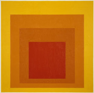
Homage to the Square
This was my first visit to the Hirshorn Museum and Sculpture Garden so I did not really know what to expect to see when I arrived. Before I visited the museum, someone mentioned in class that the only exhibition that they did not personally like at the museum was the one titled, “Homage to the Square.” So when I arrived at the museum this was the first artwork that I went looking for, as I wanted to see if I would get a similar reaction to what my classmate experienced. At first I had a very similar reaction, as I was almost bored when I first set my eyes on the large amounts of squares that surrounded me. But my thoughts changed when I took another look at the squares and really studied each piece both individually and as a whole collection. His work really stands out to anyone passing by due to the bright colors that catch your eye and capture your attention. Also due to the large amount of paintings you can’t help but notice as there are so many of them all around you. I did some research online and it said that this work by Josef Albers is his most well known and that, “these images create optical illusions, and challenge viewers’ visual acuity.” I really enjoyed how this artist was able to take such a simple concept and turn it into a beautiful and visually interesting piece. One would not normally think of different colored squares as art, but he really challenges his viewers to look at art with a more open mind and se it through a new pair of eyes.